

Visual analogies have shown to be more successful than graphs in helping patients comprehend patient-reported outcomes (PRO) according to a new study led by Weill Cornell Medicine investigators.
In recent years, the use of PROs has grown increasingly popular due to their effectiveness in informing clinicians, researchers, and policymakers about patients’ quality of life, treatment satisfaction, and disease perception. Patients, too, have benefited as PROs are critical for self-monitoring and symptom control.
However, PROs are not without their limits. Health information is often presented back to patients in the form of a line graph. In the U.S., where 40% of patients struggle with graph literacy, this can lead to miscommunications and intervention-generated inequities.
Seeking to assess objective comprehension of PROs, researchers conducted a study with 40 hospitalized patients to compare four PRO visualization types – text only, text plus visual analogy, text plus number line, and text plus line graph. The results were published on January 30 in the Journal of American Medical Informatics Association, highlighted in the May issue editorial in recognition of the International Year of the Nurse and Midwife, and presented at the AMIA Virtual Clinical Informatics Conference.
To combat challenges in displaying longitudinal changes and representing PRO scores, the visualization types displayed PRO scores out of ten, instead of raw or T scores, and used red, yellow and green as status indicators. The majority of patients (83%) accurately comprehended the visual analogy, compared to 70% for the number line, 63% for text only, and 60% for the line graph. What was attributed to the visual analogy’s success was the use of an everyday object (in this case, a gas gauge) to represent the symptom.
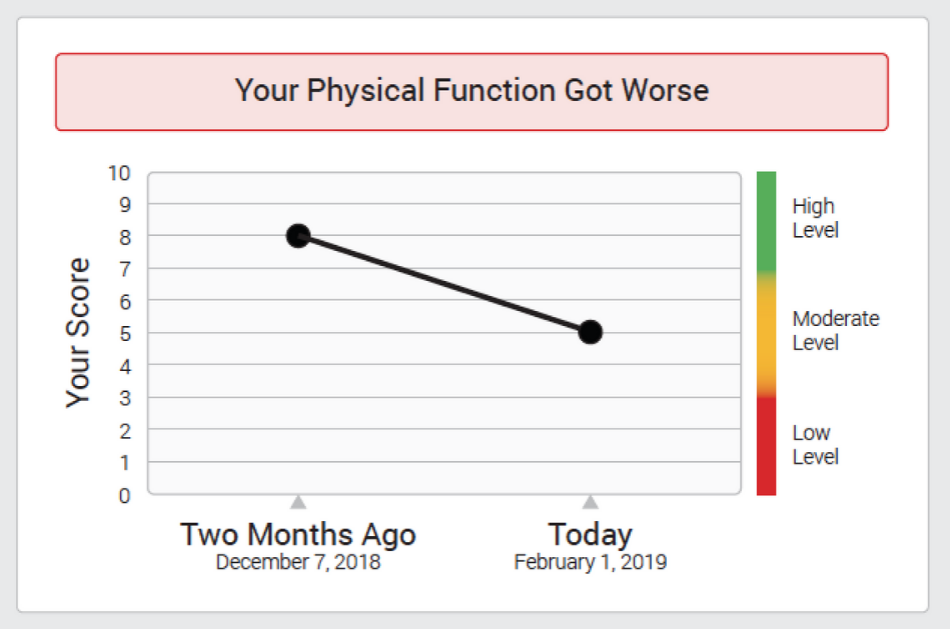
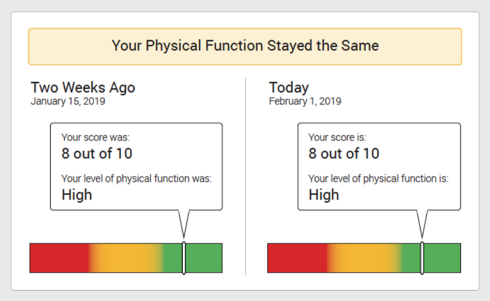
Example of text plus line graph. Example of text plus number line.
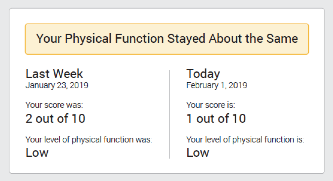
Example of text only.
“Using a symbol that the patient is already familiar with in their everyday life really helps them contextualize the health information,” said senior author Dr. Ruth Masterson Creber, assistant professor of population health sciences in the Division of Health Informatics at Weill Cornell Medicine. “We want patients to understand their own health information so that they can be empowered to focus on making decisions and taking action in response.”
Researchers also noted that objective comprehension did not always line up with subjective comprehension or preferences, which can be influenced by social desirability. The majority of patients (41%) indicated that they preferred the number line, compared to 31% which preferred the visual analogy, and 14% of participants preferred a visualization that they did not objectively comprehend.
The study’s findings have already seen dissemination in the private sector, specifically Patient Discovery which develops mobile applications for patients with chronic illnesses. Researchers intend to extend their work and continue creating visualizations types that tap into new analogies for different audiences.
“Our research raises an interesting methodology question and has broad applicability,” said first author Dr. Meghan Reading Turchioe, postdoctoral associate in the Department of Population Health Sciences at Weill Cornell Medicine. “Think about the patient portal – everything is charted in a line graph. This study calls into question whether that is the right approach.”
- Highlights